

Why Compare ETFs Systematically?
The ETF market has exploded to over 10,000 funds globally, making selection increasingly difficult. For any investment theme — S&P 500 tracking, emerging markets, technology sector, dividend income — multiple ETFs compete for your capital. They differ in expense ratios, tracking accuracy, liquidity, tax efficiency, and holdings composition. These differences compound over years, making systematic comparison essential for optimal portfolio construction.
Financial websites display ETF data, but comparing across multiple funds requires visiting dozens of pages and manually compiling data into a spreadsheet. Autonoly automates this entire process, producing a ready-to-analyze comparison in Google Sheets where you can collaborate with advisors, partners, or investment committee members.
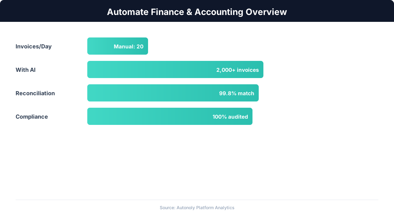
Finance automation ROI across different accounting tasks
Key Insight: CFOs report that finance automation frees up 25,000 hours annually for a mid-size company, redirecting effort from data entry to strategic analysis (Deloitte CFO Survey).
How Autonoly Compares ETFs
The AI Agent Chat lets you describe the comparison naturally. You might say "compare VOO, SPY, and IVV — show me expense ratios, tracking error, 1/3/5-year returns, and top 10 holdings overlap." The agent builds the complete comparison pipeline.
Comprehensive Data Collection
Using Browser Automation, the agent navigates to ETF detail pages on financial websites — Morningstar, ETF.com, Yahoo Finance, or fund provider sites. The full Playwright browser handles interactive charts, expandable data sections, and tabbed interfaces. The Data Extraction engine captures fund overview data (expense ratio, AUM, inception date, benchmark), performance data (1-month through 10-year returns, year-to-date), risk metrics (standard deviation, Sharpe ratio, beta, max drawdown), top holdings with allocation percentages, sector and geographic allocation breakdowns, and dividend yield and distribution history.
Analytical Comparisons
The Data Processing feature calculates comparisons that go beyond raw data. Expense efficiency scores show which funds deliver the most return per basis point of fees. Tracking error analysis reveals which index funds most faithfully replicate their benchmark. Holdings overlap analysis identifies how similar two ETFs actually are — crucial for investors trying to diversify.
The comparison logic goes beyond simple side-by-side tables. Computed columns include cost of ownership (expense ratio multiplied by investment amount showing actual dollar cost), risk-adjusted returns (returns divided by standard deviation for Sharpe-like comparisons), and tax efficiency comparisons based on capital gains distributions relative to total distributions.
The SSH & Terminal feature can run Python-based analysis for sophisticated metrics — risk-adjusted returns using the Sharpe and Sortino ratios, rolling performance windows, drawdown analysis, and factor exposure decomposition using libraries like PyPortfolioOpt.
Google Sheets Dashboard
The output is structured as a multi-tab Google Sheet. A summary tab provides a side-by-side comparison matrix with key metrics. Individual tabs show detailed data for each ETF. A holdings overlap tab visualizes shared positions. And a performance comparison tab shows returns across different time periods.
The Visual Workflow Builder lets you customize which metrics are included, how the comparison is organized, and what conditional formatting highlights the best and worst values. The Logic & Flow feature can flag ETFs that meet or fail specific criteria — for example, highlighting all funds with expense ratios above 0.50% or those underperforming their benchmark by more than 50 basis points.
Rebalancing and Ongoing Monitoring
For existing portfolios, scheduled ETF comparisons help with rebalancing decisions. Run the comparison quarterly to check whether your chosen ETFs still represent the best options in their category, or whether a new fund has launched with a better expense ratio or improved tracking accuracy. Logic & Flow controls can trigger a Slack alert when a tracked ETF's performance deviates significantly from its benchmark, ensuring the team reviews allocation decisions promptly.
The Browser Automation feature ensures data is always fresh from the source websites. ETF metrics change monthly as returns update and fund flows shift, so a monthly schedule keeps your comparison sheet current and highlights when a previously inferior ETF starts outperforming.
Collaboration and Decision Making
Google Sheets is the ideal destination because investment decisions are collaborative. Advisors can annotate the comparison with notes, portfolio managers can highlight preferred funds, and committee members can review the analysis asynchronously. The collaborative format eliminates email chains of spreadsheet attachments and ensures everyone works from the same data.
For teams managing model portfolios, the automated comparison ensures allocation decisions are always based on current data rather than stale research. Visit the templates library for pre-built ETF comparison workflows, check the pricing page, and explore the Integrations ecosystem. For more on data collection, see our guide on web scraping.
Grounding Comparisons in Official Fund Documents
Aggregator pages are excellent for fast side-by-side views, but the authoritative source for any fund metric is its prospectus and shareholder reports, which issuers file with the SEC and make available through the public EDGAR database. Expense ratios, investment objectives, and risk disclosures in those filings are the legally binding figures; third-party sites occasionally lag a fund's most recent fee change or reconstitution. A best-practice pipeline therefore treats scraped aggregator data as the convenient first pass and cites the official prospectus for anything that drives a real allocation decision. The Investor.gov education resources are also worth linking in client-facing reports, since they explain expense ratios and tracking error in plain language for end investors.
Edge Cases When Comparing Funds
Apparently simple ETF comparisons hide several traps. Distinct share classes of the same fund report different expense ratios; recently launched ETFs lack the multi-year track record that ranking logic assumes; and funds that changed their index or strategy mid-history can show performance that is not comparable across periods. Currency-hedged versus unhedged variants, dividend reinvestment assumptions in total-return figures, and survivorship bias (closed funds vanishing from screens) all distort naive rankings. Configuring the Data Processing step to align time periods, separate share classes, and annotate funds with insufficient history keeps your comparison matrix genuinely apples-to-apples rather than misleadingly precise.
Further Reading
Explore more about the tools and techniques used in this workflow: Web Scraping Best Practices, Automate Google Sheets.